Modified Dec. 20, 2013
Return to IELTS Writing Start Page
Model Answer, Cambridge Practice IELTS Tests, Book 1, Test 1, Task 1
(Read this note first, before reading the essay.)
A "Summarized Report" of the Data (which is not exactly the same as a "summary of the data")
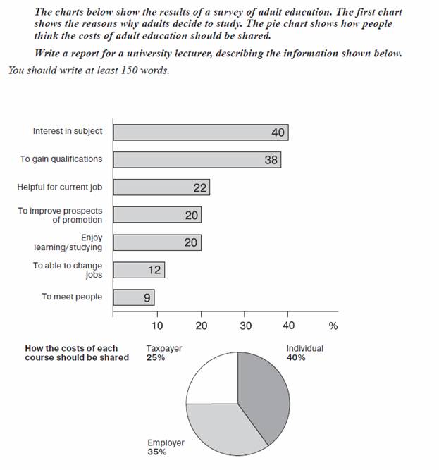
The two items of data, the bar graph and the pie chart, are related by the fact that people’s opinions on who should pay for a good or service are based on the “user pays” principle and/or the idea that those who benefit should pay.
The stated reasons why people engage in adult education can be broadly grouped into three groups: i) beneficial to the individual only; ii) beneficial to the employer only; or, iii) beneficial to both. The first group comprises, “interest in the subject” (40%), “enjoy learning/studying” (20%) and, “to meet people” (9%) giving a total of 69% out of 161% of all given reasons, i.e., approximately 40% of reasons. Therefore, the remaining approximately 60% of reasons are based on a benefit for the employer only or for both the employer and the individual.
From this analysis, one would expect the pie chart to show approximately the same percentages for “Individual” and “Employer” (within a 10% range), which it does. The 25% portion of the pie chart for “taxpayer” most probably indicates that a significant proportion of people believe adult education brings considerable benefits to society as a whole, and that such a service should not be paid for on the “user pays” principle alone.
Word count = 206
+++++++++++++++++++++++
This question is from Test 1, Cambridge Practice Tests book 1, which was written in 1996. Notice that the task wording, “Write a report for a university lecturer, describing the information below” was later replaced by, “Summarize the information by selecting and reporting the main features, and make comparisons where relevant”, which is used in the wording of Task 1 questions today. The earlier wording implies a more complete description of all the data, and a “report” is usually longer, more detailed and more complete than a “summary”. A report also requires an introduction and a conclusion, which a summary does not require. The fact that candidates only have about 20 minutes to analyze the data and write the essay was probably the main reason why the wording was changed.
As well as that, the data from this particular question requires some interpretation or even a few assumptions, which are suitable for the given task of “write a report” but are not appropriate when writing a summary of given data. In addition to my decision on what reasons constitute, "beneficial to the individual alone", other examples in this essay of an interpretation/assumption and a conclusion are:
“people’s opinions on who should pay for a good or service are based on the “user pays” principle and/or the idea that those who benefit should pay”,
"one would expect the pie chart to show" and,
“The 25% portion of the pie chart for “taxpayer”most probably indicates that a significant proportion of people believe adult education has considerable benefits for society as a whole and that such a service should not be totally based on the “user pays” principle.”
So I have tried to incorporate those features of the “summary” wording that today’s Task 1 ask the candidate to do, while at the same time including some interpretation of the data because the nature of the data requires it. This kind of interpretation, based on assumptions about people's thinking, should not be included in today’s Task 1 essays (or very little of it should be included), although it can be implied (understood). In fact, today’s Task 1 essay questions are written so that virtually no interpretation is required – you basically just need to summarize and compare, and not write a conclusion.
The wording and organization of today’s Task 1 essays can be such that the ending of the essay leaves the reader with a “conclusion” feeling, which is an advantage when communicating, but it is not always possible to achieve such an impression in the reader's mind because of the nature of the data, so this is not considered to be an absolutely vital attribute of a summary.
A real, adequate “report” should include a much more detailed analysis of the data than what I wrote, and would be about 300 words long – I basically wrote a combination of “a summary” and “a report”, but without much of an introduction.
Overall, I don’t think this is a very suitable Task 1 question to use as an example if you are preparing for the test today and I suggest only using this model answer as an example of some English to use rather than a complete model of a Task 1 essay for today.
+++++++++
Bar graph – some adults students surveyed
Pie chart – not stated if the same adults as in first chart, or if it was a survey of random people in society but the latter is implied
Total of 161% for reasons, indicates that some people gave more than one reason, ie., people were asked, “reasons”, not, “the main reason”.
Pie chart = based on an average of many answers. The pie chart specifically refers to people’s views on “sharing” the cost, not simply people's views on "who should pay". That is, it probably does not represent people’s answers to a single question, “Who should pay?”, such as a question asking to choose one out of the three choices shown, although the results of such a question could be averaged to produce the pie chart that is shown.
+++++++++
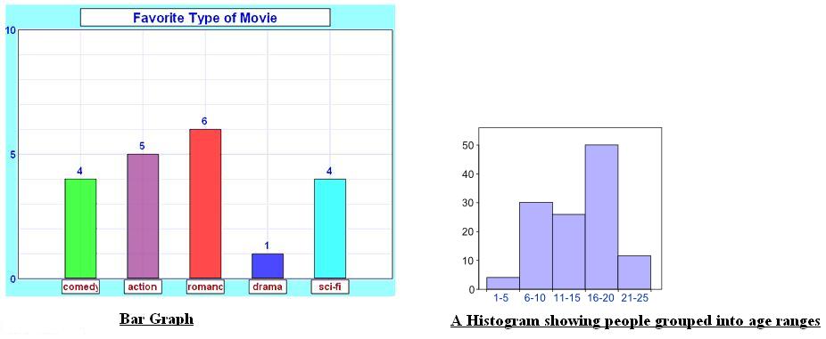
The Difference Between a Histogram and a Bar Graph
Previously, I had written that the bar graph here was a "histogram". That was a mistake. The two are similar but different. The following two web pages explain the difference very clearly – http://www.mathsisfun.com/data/histograms.html, which leads to http://www.mathsisfun.com/data/bar-graphs.html
The difference is that a bar graph (also called a bar chart) is a graphical display of data using bars of different heights, but a histogram shows continuous data (= data that could be shown as a continuous line graph) grouped into equally spaced ranges. In the examples below, the bar graph shows the number of people who chose a certain type of movie as their favourite. The histogram, from a survey of people who went to a shop, shows the number of people in each age range, up to age 25.
Overall, I don't think it is always necessary to name what type of chart or graph is shown as the data, but if you do, it should be a correct name.